Manischewitz Rebrand: Sweet or Sour?
Manishewitz is a classic and iconic brand in the American Jewish market. For instance, they are well-known for their Passover Matzos and sweet Kosher wines. Their Tam Tam crackers are also rather popular.
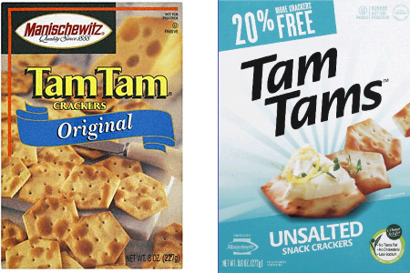
Manishewitz recently did a rebrand.

Is this a good or a bad rebrand? I say it is confusing. For instance, I barely recognize the new Tam Tams carton. While I am generally a strong proponent of minimalist design, here I feel that the strongly iconic logo and color scheme, and placement of the logo itself, are too removed from the classic that the effect is somewhat jarring and unfamiliar. A good rebrand should preserve recognizable elements of the old brand and transition into the new identity.
It is likely that this is no accident: The brand is probably repositioning toward a general-market strategy and away from the heavily Jewish brand associations of the old identity. However, they are at risk of alienating their loyal core customers.
What do you think?