Data Visualizations as Works of Art
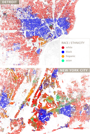
I love the concept of pulling data sets from publicly-available data and turning them into strikingly visual graphical representations. In a fascinating article entitled "Points of Interest" from the May-June issue of The University of Chicago Magazine, Google programmer Eric Fischer demonstrates how one can map geographic data of major US cities into unique works of art - in this case, maps that plot regions of race and ethnicity in those cities.